Movie Poster Drafts
The first movie poster I sketched out is nearing towards the thriller genre. This may be a successful way of adding thrill to my film. The title of the movie will be in a bold capital font and won't have any connotations of a bubbly storyline. From my poster research I learnt that having too many colours can give off a happy vibe quickly. This is why I plan to have minimal colours in the poster. The credits will be below the movie title. - and the characters names above their character.
In this movie poster it is the protagonists face only. The other character (antagonist) has been kept a mystery from the audience. The title is like the one above. This is because it is bold and creates the psychological genre vibe more than any other font. Furthermore, the credits are besides the protagonists face. The protagonists face being the main image on the movie poster creates the thrilling mood.
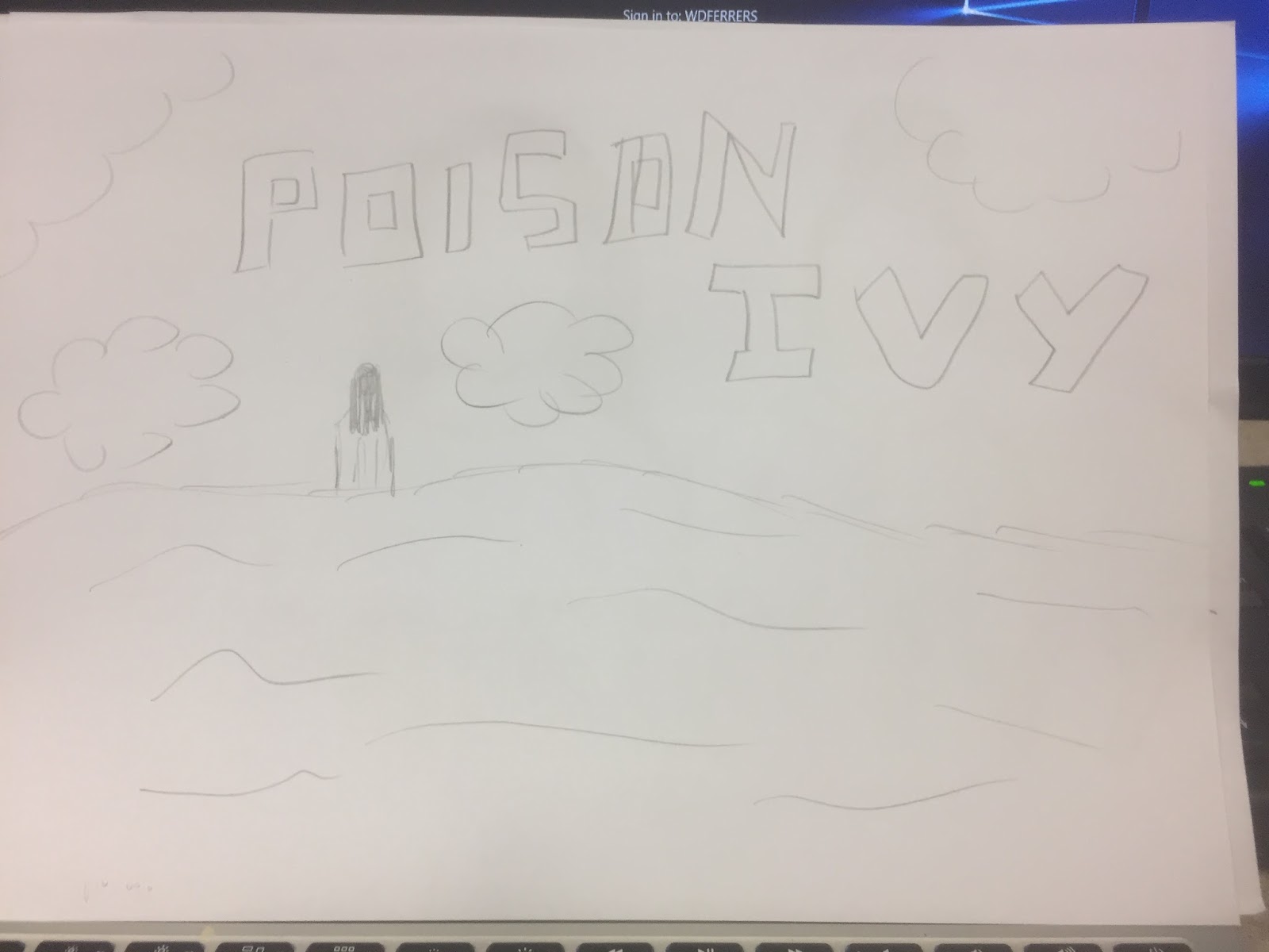
Furthermore, this movie poster draft I sketched out was coming from a different approach. This is because it is a long shot of the protagonist. This isn't giving too much away about the film. Carries on the conventions of a psychological movie and adds a mystery to the plot. Additionally, the title is more thin but still is in a capital letter form. This just adds structure to the poster. The scenic landscape being on the poster creates a thrilling and dramatic feel as there is little around (no people or buildings).


No comments:
Post a Comment