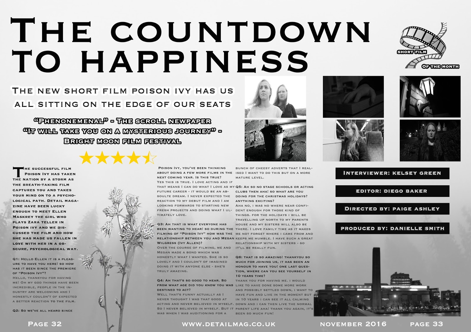
To start my film poster, I two posed photos that I took of the girls and my main character Zara. I wanted to do one image of the two characters and then another of just Zara. I did this because the story has two dimensions and I really wanted this to be conveyed through the triad of my products.
Secondly, There is a gap in the centre to put the film title and extra information. This is because It fits with the conventions of a psychological film poster.
Lastly, I chose these images as they forebode a lot about the story line but to an external view it seems to be quite vague. This symbolises the film and how it unravels into a dark twisted plot.
This section will contain the title and extra information. I have used the smudge tool to slightly smudge the photo into the white space. This will give it a cloudy/smoky look and fit with the underlying message.
Here I added the smoky image into the gap. I chose to use a smoky image as the film does represent this image a lot. Furthermore, I wanted this smoky image to be in-between the two images as this symbolises the separation of the alter egos of Zara. The top image is conveying the person Ivy knows and the image below is the person that is hidden and is unleashed at the end of the short film.
I then added the people starring the short film, the film title, and the added information below. This is all central as it structures the film poster nicely.This box of information is centrally placed due to the people viewing the poster will see the film title first and they will then remember the film title due to its centrality and boldness.
After that, I added the review given by a film festival I made up. This gives an instant idea to the viewer about how high quality the short film is.This also gives a sense of thrill to the person viewing the poster; this is highlighted through the reviews and the poster having dark, smokey tones.
Monday, 12 December 2016
Friday, 9 December 2016
Double Page Spread - In Process
To commence my double page spread (dps) I got this picture of a misty, foggy forest to set a grey misty tone to the page. I Thought this would set the double page's mode of address as mysterious and carry on the hegemonic psychological aspect of the triad of products I have produced.
I then turned the opacity from 100% to 40% as I wanted it to be in the background but still visible (not overlooking all the later features). This was to make it still visible but faint as I wanted other all the other features on the double page spread to pop whilst this is settled in the background; to add depth.
I then added two more features. The headline "The countdown to happiness" forebodes my short film's motive and message - but this doesn't give away too much detail. I did this in the font "Copperplate Regular" in black. This is because I didn't want to add any cheesy detail and make it look friendly looking. I also added bramble which I cut out using the polygon lasso tool. This sits over the background nicely. I wanted the bramble to be able to separate two sections of text and I believe this accentuates the column structure.
Next, I added the coverlid and the article - which is another blogpost. I did this with a stroke of 8 on as it outlines the cover line quite nicely and separates it from all the other text. I also put the Q&A in the dps. I did this in 3 columns and different colours (question = black, answers = grey). I lined them up using a grid layout.
After that, I added the rating and comments made from the newspaper I made up and also a film festival. I also did this in a stroke. The stars not only instantly/visually tells the reader the quality of the short film but adds a tad of colour. I also added the page numbers and issue date at the bottoms of the page. This also made my mode of address for the double page spread more approachable - possibly increasing my target audience.
I then added the multiple images from the film into my double page spread. I did this also using the guide layout. This gives people an emotion to expect when watching the film but this does not ruin the whole surprise and shocking aspect of it.
After that I then added the four black rectangles into the double page spread. These contain the director's name, editor, interviewer and producer. This is a personal touch to the magazine/double page spread.
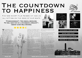
Finally, I added the short film of the month logo that I created into the top right corner. This makes it look like the magazine features short films and is a nationally/globally read magazine. The film weaves in with the overall look of the magazine. Yet again, people will see this along with the reviews and expect a greater performance and overall short film.
I then turned the opacity from 100% to 40% as I wanted it to be in the background but still visible (not overlooking all the later features). This was to make it still visible but faint as I wanted other all the other features on the double page spread to pop whilst this is settled in the background; to add depth.
I then added two more features. The headline "The countdown to happiness" forebodes my short film's motive and message - but this doesn't give away too much detail. I did this in the font "Copperplate Regular" in black. This is because I didn't want to add any cheesy detail and make it look friendly looking. I also added bramble which I cut out using the polygon lasso tool. This sits over the background nicely. I wanted the bramble to be able to separate two sections of text and I believe this accentuates the column structure.
Next, I added the coverlid and the article - which is another blogpost. I did this with a stroke of 8 on as it outlines the cover line quite nicely and separates it from all the other text. I also put the Q&A in the dps. I did this in 3 columns and different colours (question = black, answers = grey). I lined them up using a grid layout.
After that, I added the rating and comments made from the newspaper I made up and also a film festival. I also did this in a stroke. The stars not only instantly/visually tells the reader the quality of the short film but adds a tad of colour. I also added the page numbers and issue date at the bottoms of the page. This also made my mode of address for the double page spread more approachable - possibly increasing my target audience.
I then added a still of my short film into the bottom right corner. I cut this out using the polygon lasso tool and it adds visual appeal to the page. From my target market research I gathered that people would prefer seeing a variety of stills and posed photographs in the double page spread.
I then added the multiple images from the film into my double page spread. I did this also using the guide layout. This gives people an emotion to expect when watching the film but this does not ruin the whole surprise and shocking aspect of it.
After that I then added the four black rectangles into the double page spread. These contain the director's name, editor, interviewer and producer. This is a personal touch to the magazine/double page spread.

Finally, I added the short film of the month logo that I created into the top right corner. This makes it look like the magazine features short films and is a nationally/globally read magazine. The film weaves in with the overall look of the magazine. Yet again, people will see this along with the reviews and expect a greater performance and overall short film.
Thursday, 8 December 2016
Article for my Double Page Spread
I will have my double page spread to be set out in a Q&A format. This is because the short film is set in a serious mature tone and I wanted to portray the fictional part of it. Therefore, the article is set in a chatty tone - to show the fictional outrageous characteristics the character Zara Teller has.
The article:
The successful film Poison Ivy has taken the nation by a storm as the breath-taking film captures you and takes your mind on to a psychological path. Detail magazine have been lucky enough to meet Ellen Maskrey the girl who plays Zara teller in Poison ivy and we discussed the film and how she has made us fallen in love with her in a obscure, psychological way.
Q1: Hello Ellen it is a pleasure to have you here! so how has it been since the premiere of “Poison Ivy”?
Hello, thankyou for having me! Oh my god things have been incredible, people in the industry are welcoming and I honestly couldn’t of expected a better reaction to the film.
Q2: So we’ve all heard since Poison Ivy, you’ve been thinking about doing a few more films in the next coming year. Is this true?
Yes this is true. I love acting and if that means I can do what I love as my future career - it would be an absoulte dream. I never expected the reaction to my debut film and I am looking forwards to starting new fresh projects and doing what I ultimately love.
Q3: Ah that is what everyone has been wanting to hear! so during the filming of “Poison Ivy” how was the relationship between you and Megan Wilgress (Ivy Allen)?
Over the course of filming, me and Megan made a bond which was honestly what I wanted. She is so lovely and I couldn't of imagined doing it with anyone else - she's truly amazing.
Q4: Ah that's so good to hear. So from what age did you know you was destined to act?
Well that's funny actually as I never thought I was that good at acting and never believed in myself. So I never believed in myself. But it was when I was auditioning for a bunch of cheesy adverts that I realised I want to do this but on a more mature level.
Q5: Ah so no stage schools or acting clubs then aha! so what are you doing for the christmas holidays? anything exciting?
Aha no, i was no where near confident enough for those kind of things. for the holidays i will be travelling up north to my parents house and my sisters will also be there. I love family time as it makes me not forget where i came from and keeps me humble. I have such a great relationship with my sisters - so it’ll be really fun.
Q6: that is so amazing! thankyou so much for joining us, it has been an honour to have you! one last question, where can you see yourself in 10 years time?
thank you for having me. i would like to have done some more work and possibly settled down, i want to have fun and live in the moment but in 10 years i can see it all calming down and i can then live the normal parent life aha! thank you again, it’s been so much fun!
The article:
The successful film Poison Ivy has taken the nation by a storm as the breath-taking film captures you and takes your mind on to a psychological path. Detail magazine have been lucky enough to meet Ellen Maskrey the girl who plays Zara teller in Poison ivy and we discussed the film and how she has made us fallen in love with her in a obscure, psychological way.
Q1: Hello Ellen it is a pleasure to have you here! so how has it been since the premiere of “Poison Ivy”?
Hello, thankyou for having me! Oh my god things have been incredible, people in the industry are welcoming and I honestly couldn’t of expected a better reaction to the film.
Q2: So we’ve all heard since Poison Ivy, you’ve been thinking about doing a few more films in the next coming year. Is this true?
Yes this is true. I love acting and if that means I can do what I love as my future career - it would be an absoulte dream. I never expected the reaction to my debut film and I am looking forwards to starting new fresh projects and doing what I ultimately love.
Q3: Ah that is what everyone has been wanting to hear! so during the filming of “Poison Ivy” how was the relationship between you and Megan Wilgress (Ivy Allen)?
Over the course of filming, me and Megan made a bond which was honestly what I wanted. She is so lovely and I couldn't of imagined doing it with anyone else - she's truly amazing.
Q4: Ah that's so good to hear. So from what age did you know you was destined to act?
Well that's funny actually as I never thought I was that good at acting and never believed in myself. So I never believed in myself. But it was when I was auditioning for a bunch of cheesy adverts that I realised I want to do this but on a more mature level.
Q5: Ah so no stage schools or acting clubs then aha! so what are you doing for the christmas holidays? anything exciting?
Aha no, i was no where near confident enough for those kind of things. for the holidays i will be travelling up north to my parents house and my sisters will also be there. I love family time as it makes me not forget where i came from and keeps me humble. I have such a great relationship with my sisters - so it’ll be really fun.
Q6: that is so amazing! thankyou so much for joining us, it has been an honour to have you! one last question, where can you see yourself in 10 years time?
thank you for having me. i would like to have done some more work and possibly settled down, i want to have fun and live in the moment but in 10 years i can see it all calming down and i can then live the normal parent life aha! thank you again, it’s been so much fun!
Symbolisation Of Light
When looking at a image, a painting, a video etc; I always focus on the lighting in the picture. I see what has the most light and was is in darkness. From there I interpret the lighting and try to understand the painter/photographer/directors meaning of the light. Typically, I see the most lit thing to be the subject that the creator wants the most attention on, and the dark objects to have less attention as they're hidden. below are a few examples that I clearly see this representation.
Editing Photos For my Double Page Spread & Movie Poster
Equipment For my Short Film/Photographs
To take my photographs I used a Canon EOS Digital Camera which made my photographs and filming appear in high quality and look clear. I also used a tripod to steady the shots which ensured the photos to look structured. I considered using a dolly for my moving shots but they turned out to look too smooth and the slight vague handheld effect suited my short film more overall.
Alterations to the structure of my Short Film
I have made a few alterations to my short film. This is because when it came to filming I saw some frames to work out better than the originally planned ones. I have flipped a few frames around as when editing it seems to make more sense when watching it. I have added a few more mis en scene frames, which gives the audience more of an idea of what these two characters are like.
Subscribe to:
Posts (Atom)