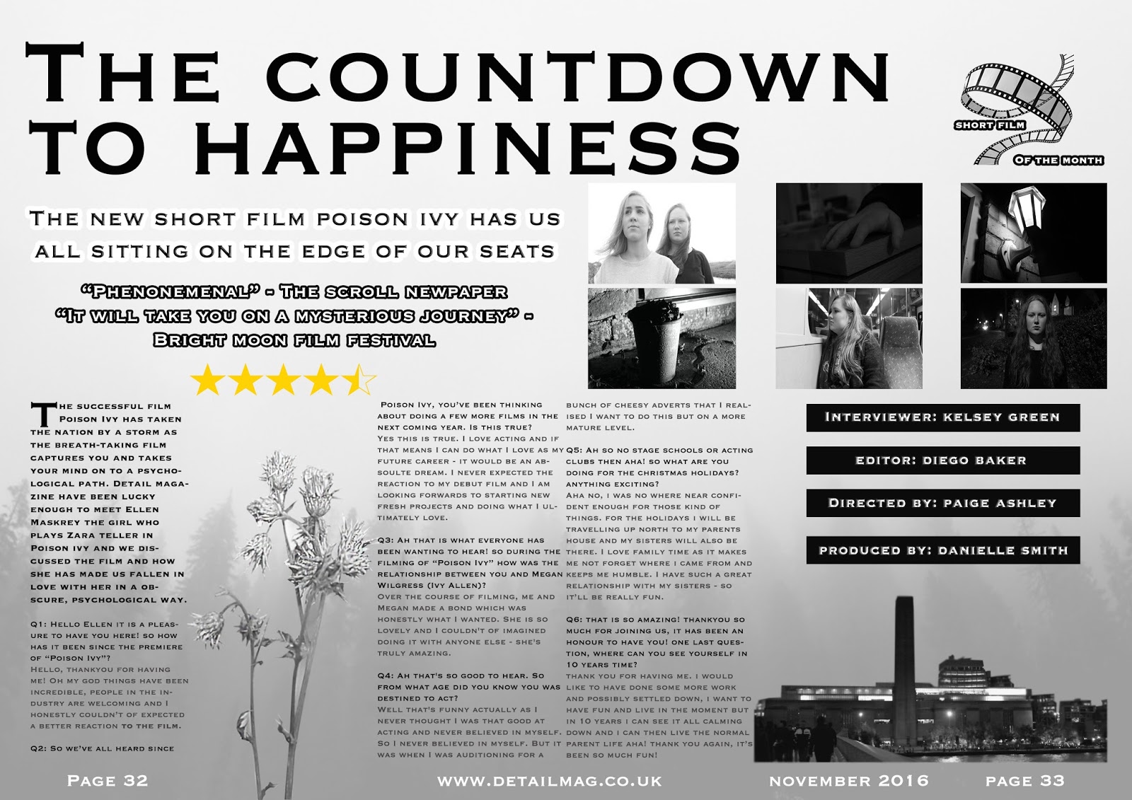
To commence my double page spread (dps) I got this picture of a misty, foggy forest to set a grey misty tone to the page. I Thought this would set the double page's mode of address as mysterious and carry on the hegemonic psychological aspect of the triad of products I have produced.
I then turned the opacity from 100% to 40% as I wanted it to be in the background but still visible (not overlooking all the later features). This was to make it still visible but faint as I wanted other all the other features on the double page spread to pop whilst this is settled in the background; to add depth.
I then added two more features. The headline "The countdown to happiness" forebodes my short film's motive and message - but this doesn't give away too much detail. I did this in the font "Copperplate Regular" in black. This is because I didn't want to add any cheesy detail and make it look friendly looking. I also added bramble which I cut out using the polygon lasso tool. This sits over the background nicely. I wanted the bramble to be able to separate two sections of text and I believe this accentuates the column structure.
Next, I added the coverlid and the article - which is another blogpost. I did this with a stroke of 8 on as it outlines the cover line quite nicely and separates it from all the other text. I also put the Q&A in the dps. I did this in 3 columns and different colours (question = black, answers = grey). I lined them up using a grid layout.
After that, I added the rating and comments made from the newspaper I made up and also a film festival. I also did this in a stroke. The stars not only instantly/visually tells the reader the quality of the short film but adds a tad of colour. I also added the page numbers and issue date at the bottoms of the page. This also made my mode of address for the double page spread more approachable - possibly increasing my target audience.
I then added a still of my short film into the bottom right corner. I cut this out using the polygon lasso tool and it adds visual appeal to the page. From my target market research I gathered that people would prefer seeing a variety of stills and posed photographs in the double page spread.
I then added the multiple images from the film into my double page spread. I did this also using the guide layout. This gives people an emotion to expect when watching the film but this does not ruin the whole surprise and shocking aspect of it.
After that I then added the four black rectangles into the double page spread. These contain the director's name, editor, interviewer and producer. This is a personal touch to the magazine/double page spread.
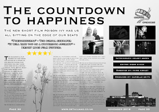 Finally, I added the short film of the month logo that I created into the top right corner. This makes it look like the magazine features short films and is a nationally/globally read magazine. The film weaves in with the overall look of the magazine. Yet again, people will see this along with the reviews and expect a greater performance and overall short film.


No comments:
Post a Comment