Wednesday, 5 October 2016

Psychological Movie Poster & Double Page Spread Survey Results


 From the survey I carried out, I have gathered useful information which was completed by the demographic that would view my short film. This question was purely on what people would find most important when looking at a psychological movie poster. I collected the result that a image that doesn't give away too much about the story and ending is most effective. This also told me that black and white was a ideal decision for my short film and genre. 


From this question, I learnt that the demographic would expect to see on a psychological movie poster. The answers that struck me most and I will use to my initiative will be:

"Dramatic visual effect"

"Being very subtle but still showing a very brief look at what it is about"

"Dark, mysterious and excitement".
In this question, I asked if the audience answering my survey, if they could rate on a scale from 1-5, on how important the movie poster is in their opinion. This also showed how essential they thought the movie poster was in terms of tempting them to want to watch the film. The total average of the results was 4.13. This being a significantly high number makes me know that the movie poster is incredibely important when it comes to drawing in my target audience.
 Whilst making my short film, I wanted to have an understanding of how the poster could interpret the psychological genre. So in this question, I was intrigued to see what people said. The answers that stood out made me see how the film, poster and double page spread all link in and communicate with the consumer as a triad. The answers that I will use to my advantage most are: 

"Good visual effect"

"By good illustration"

"Distortion of the image..."
 In this question, I was intrigued to know what kind of layout for the double page spread people would be most attracted to. By carrying out this research, I have gathered that a double page spread with majority images will be the most effective to represent the psychological genre. 
Finally, this question was purposely to see what people wanted when reading the article (what kind of images etc).
From carrying out this question, I have learnt that people voted highly for each answer. By this bar chart result, I have decided to use all four on my short film double page spread.

Psychological Movie Poster & Double Page Spread Survey

Create your own user feedback survey


https://www.surveymonkey.com/results/SM-MGFSS6HX/

Movie Double Page Spread Drafts

 These are my drafts for my double page spread. I used the conventional double page spread layout for my genre and also experimented with other basic layouts. For this one, there is a mixed amount of images and text. This keeps the two pages structured. The title will overlay the main image. Their will also be a pull quote on the image. This will be from the film not the article. There is a drop cap and columns for text. There is multiple other images around the border of the double page spread.
 For this double page spread, one of the pages is just for the main image. The movie title again will overlay the image. This influenced me because of the Twilight double page spread i analysed. The right page will contain the article. It will start with a drop cap and the text will part for a pull quote. There will be reviews/ratings scattered around the page. Furthermore, the mode of address will be more serious and connote a more intense vibe more than anything. The running head will be just above the main text. 
For the last double page spread draft that I sketched, i wanted to try and see what a more "chaotic" look would appear as. It seems busy but could potentially pull in the reader and tease them into reading the article and wanting to watch the movie. This will be done by slightly more colour and more images. It's perhaps a more fun layout. The title being in between images and a pull quote will highlight the detailed and mysterious short film it will be. There being more images will draw in the visual readers and may give people more of a feel for what the film will display to look like. The images being black and white may make the colour on the double page spread pop out even more. - however, I need to lean away from a happy and comedic vibe.

Fonts for my Movie Poster/Double Page Spread


Sunday, 2 October 2016

Movie Double Page Spread Mock up


Movie Poster Digital Mock up

 
For my movie title for the draft, I used photoshops tools to play around a to experiment with the title appearance. This included colours, shading, font, glows and overall finish of the text.

Movie Poster Drafts

The first movie poster I sketched out is nearing towards the thriller genre. This may be a successful way of adding thrill to my film. The title of the movie will be in a bold capital font and won't have any connotations of a bubbly storyline. From my poster research I learnt that having too many colours can give off a happy vibe quickly. This is why I plan to have minimal colours in the poster. The credits will be below the movie title. - and the characters names above their character.
In this movie poster it is the protagonists face only. The other character (antagonist) has been kept a mystery from the audience. The title is like the one above. This is because it is bold and creates the psychological genre vibe more than any other font. Furthermore, the credits are besides the protagonists face. The protagonists face being the main image on the movie poster creates the thrilling mood. 
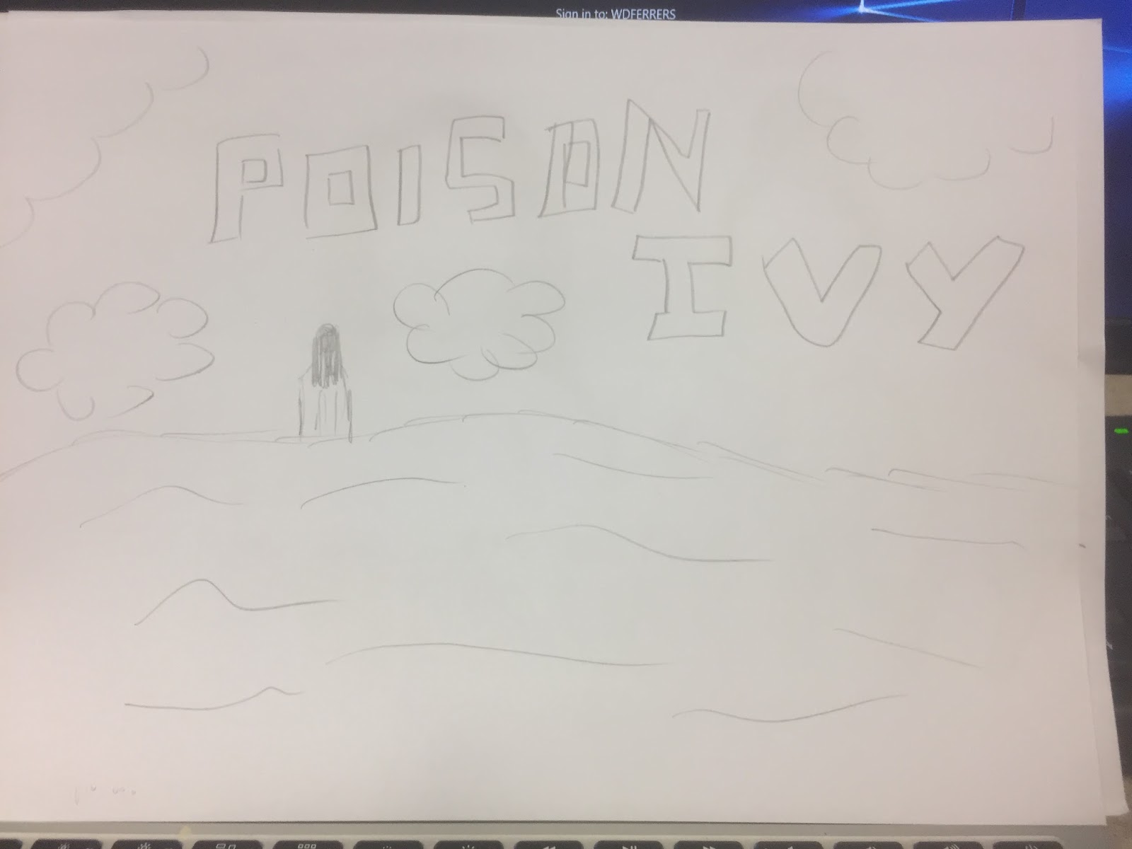
Furthermore, this movie poster draft I sketched out was coming from a different approach. This is because it is a long shot of the protagonist. This isn't giving too much away about the film. Carries on the conventions of a psychological movie and adds a mystery to the plot. Additionally, the title is more thin but still is in a capital letter form. This just adds structure to the poster. The scenic landscape being on the poster creates a thrilling and dramatic feel as there is little around (no people or buildings).