Thursday, 15 December 2016

Wednesday, 14 December 2016
Evaluation - Question 1
Transcript:
Short Film
In my short film, time and a countdown was crucial to my storyline. This is because Zara was counting down to this event and this clearly highlights the psychological aspect of my short film. This is because it is typically an exciting event when you are counting down and therefore this creates a twisted dark plot for my short film. This is also done in the psychological film “Gone Girl” as they also use a mid close up of a calendar; similar to my shot. This is done in the same type of way and creates the exact same effect. This enhances the psychological genre.
Secondly, there is another closeup of a record player in my short film. This was purposely done to create a atmosphere were we have a look into the main character’s diegesis. This gives the audience a look into the attention to detail for the diegesis. The record player shot was also in slow motion which managed to slow down the pace and give the viewer a calmer watch. This nicely matched to the pace of the song in the background. This was also done using an extreme closeup in the film Whiplash. This was because the intensity of an extreme closeup matched the effect the film wanted to portray.
The mid shot of Zara smoking creates a dark plot quickly. the shot not only is intense due to the eye contact but also because of the uncomfortable message the audience are receiving. In the film Donnie Darko this has also been done to let Donnie look straight at the viewer and make them feel on edge.
When my protagonist Zara is walking towards the garage, it is a dark and mysterious shot. This fits in with the conventions of a psychological short film as the Mise en scene is minimal for the shot and not a lot of detail is involved. The shot transitions from a mid shot to a long shot as she is walking away from the camera. This is similar in the film Donnie Darko as he is the prime subject in the shot and nothing overshadowed him.
Furthermore, the shot of my antagonist in bed creates a more mature theme to the film. This is just accentuating her perfections and how Zara may view her as “too beautiful”. This shot being a birds eye view lets us view her in full detail and see her in the way Zara or possibly even a lover would see her. Also in the film american beauty this image is portrayed using the blonde woman laying in petals. This highlights the woman’s provocative appearance and raises the factors of how they may seem heavenly in the other characters eyes. This only maintains the typical traits of a psychological genre.
In my short film, the scene of Zara dragging the body convey a raw edge of how the body has been killed and is being shown. It brings a violent message which evidently conveys the “psychotic” characteristics the main character has. This has been also done in the psychological short film “letter”. The man is dragging his partners body and implies nothing but inevitable danger.
Furthermore, the shot of multiple images on the wall convey obsession. This is also done in the film one hour photo as the main character is standing and viewing his wall of images. This is a shock factor as it physically shows the twisted person in the film.
To transition the shot of ivy in bed to ivy dead, i wanted to give a clear impression of how Zara preferred the outcome to be this way. This also carries on the psychological genre. By this I used the fade in transition on iMovie. This creates a smooth glide into the next frame but it also maintains the thrill within the plot.
In my short film I used a lighting technique to portray the two characters. the character Zara is the dark and is always in the shadows and ivy is the light which is lit up with beauty. The symbolisation this gives is that Zara even sees herself in the dark and how she is not in denial.
In my short film I used a voiceover as the main source of sound. This is in a letter form and adds personal touches to the short film. I decided i wanted Zara to be the only character to talk, as the film wouldn't be as mysterious if we heard both sides of the situation. in this case the audience are bias and believe Zara; regardless of her psychotic characteristics. It connotes the conventions of a psychological film and instantly adds a cold touch to the film. IN the short film letter this is also done and it successfully creates a thrilling plot.
Lastly, the music i used in the background was to set a scene of mystery. The song is quite eery and sets each scene as a dark and gloomy one. The song is in the background and doesn’t overrule the voiceover in the film or any of the shots.
Magazine Double Page Spread
Firstly, to follow conventions of a typical double page spread. I used the twilight double page spread to inspire me. This made me decide to have my headline on the magazine to be a foreboding sentence towards the plot rather than the film title. This is because it creates a mode of address for the article rather than just stating the film title. This carries on the conventions of my film and highlights the psychological aspect throughout the triad of the products for poison ivy.
Next, with the images on my double page spread I wanted to show a variety of stills, action shots and candid photos. This gives a small element of the film in action and also some posed shots to convey certain messages within the psychological field. Avatar also did this on their double page spread as it gives away the beauty of the film which is an important factor for the film to get across to its demographic. This is also the same for my short film Poison Ivy.
I also used a black, white and grey colour scheme for my double page spread. This is simply due to the short film also being black and white. However, the double page spread being this way lets the psychological conventions carry on throughout the double page spread. The colours mix well and it isn't being overshadowed by any other bright colours. The only colour is for the rating and this is because the reputation of the film should be a key factor. Twilight also did their double page spread in black and white. It carries a more mature tone and it fits with its target demographic. This is similar for me and how I want this to attract to the demographic for my short film.
To commence the article for my short film, I wanted to use a drop cap to start the text. It gives a structured appearance and Is a good way to navigate the reader to the start of the article. As well as this, It is not too much bigger than the rest of the text as I wanted to focus on the overall appearance and content within the article. The articles for Twilight, Avatar and Shutter Island also have a drop cap due to the conventions of a double page spread.
Film Poster
The colour scheme for my film poster runs along with the double page spread and with the short film. I carried this monochrome colour scheme so my ancillary products all cooperate with one another. I also did this colour scheme to carry on the typical conventions of the psychological genre. The film poster’s I analysed previously were all in colour. However, I believe that my film poster needed to lean away from the typical eye catching film poster due to the story line not having a rose tinted perspective on it; ultimately it is dark and sinister and I wanted that to evidently show.
Furthermore, to lean away from conventions of a psychological film poster, I used two images to portray the story line and also the plot twist. The two images forebode the ending but this is does not reveal the entire story line or the ending. Zara’s facial expressions are also foreboding the ending.
The movie title in my film poster is in the centre of the poster. This structures the poster nicely and runs with conventions. Gone girl, shutter island and donnie Darko’s film posters inspired me to put the film title in the centre of the poster. This is easy for people to identify the film and is eye-catching. This is also in a bold structured font. This is simply for a clean looking poster. A more extravagant font would convey it to be a happy or positive film and would also be harder to read at a quick glance. Therefore, my choice in font is successful.
I also put the reviews of the film on the top of the poster. This enhances the quality of the film as people view the outstanding review it has received. This leads people to want to see the film and likely to remember the ancillary products to be related to one another.
The credits of the film are located on the poster; just below the film title. This is to show the main actors names and to give credit to the people who had a contribution towards the making of the film. This is important and also runs with conventions as it has a professional appearance to the film poster.
Monday, 12 December 2016
Symbolisation of "I've got no strings"
I thought the song "Ive got no strings from the film "Pinocchio" was a wise choice for multiple reasons. Firstly, I believe that the metaphor "I've got no strings" fits well with my character Zara as she has no longer any strings and she is free from all control from Ivy. Secondly, she see's herself as Ivy's puppet. As well as this, I thought the idea of having such a mature storyline with a murder would be highlighting contrast with this song playing whilst the credits play. The song has positive connotations and implies freedom; matching with Zara's feelings. The murder of Ivy is negative and the song is positive; they contrast perfectly. 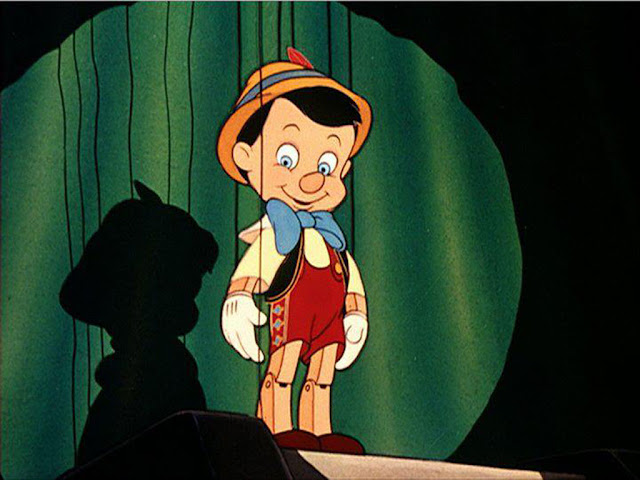

Film Poster - In Process

Secondly, There is a gap in the centre to put the film title and extra information. This is because It fits with the conventions of a psychological film poster.
Lastly, I chose these images as they forebode a lot about the story line but to an external view it seems to be quite vague. This symbolises the film and how it unravels into a dark twisted plot.


Subscribe to:
Posts (Atom)